A New Look for Scarsdale
- Wednesday, 30 March 2022 11:35
- Last Updated: Wednesday, 30 March 2022 14:41
- Published: Wednesday, 30 March 2022 11:35
- Joanne Wallenstein
- Hits: 4288
 What words come to mind when you think of Scarsdale? Excellence, stability, classic, volunteerism, small town, charming, historic and traditional were just some of the descriptors that emerged from recent focus groups of residents conducted by the Village’s Advisory Council of Communications (ACC).
They did this research as a part of a rebranding process, to update and unify the Village’s graphic look on communications, the Village website, signage, buildings, vehicles and other entities. On March 29, 2022, Dara Gruenberg, Chair of the Advisory Council of Communications presented a progress report at a work session of the Village Board.
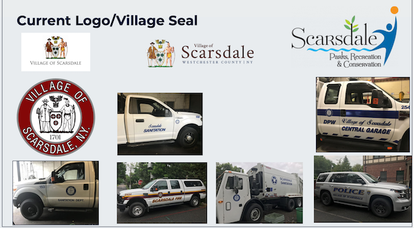
The Village’s current seal, which includes a native American and a pilgrim, looked dated and was not consistently used as an identifier. Furthermore, Gruenberg explained, "The ACC discovered that what had evolved over time was that the Village was using it’s seal as the logo but they actually don't have an official logo. Why this is an important point is because a seal and a logo are very different things….a seal is used in a legal capacity whereas a logo is a visual representation of brand. Therefore, it became even clearer that the Village needed to develop a visual identity for Scarsdale that is intentional and also represents who we are today.”
In order to formulate a new look, the Advisory Council on Communications harnessed the talents of their twelve members and other residents and undertook a professional branding process which included research and focus groups to inform the design process.
The results of this year-long endeavor, were unveiled at a meeting in Village Hall on March 29, 2022, and on the Village website on March 30, 2022.
Gruenberg explained the process. The committee called on Village Historian Jordan Copeland to analyze Village history and the evolution of its identity. They looked at other municipalities to review their branding and held focus group with different constituencies.
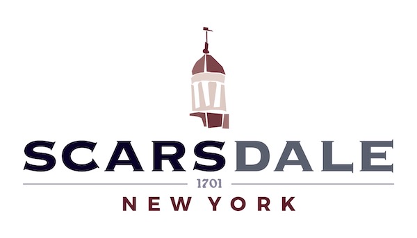
Based on this feedback, designers Kerry Hayes and Diane Greenwald developed three concepts which the committee considered and then selected the logo above. It features the village color palate – blue, gray and maroon, an illustration of the cupola atop the Harwood Building and the year of Scarsdale’s founding. According to Gruenberg, “The design combines classic and modern typefaces to look retro, idyllic and nostalgic and connect to good elements from the past.” The logo has been incorporated into a seal and two logo designs so that it can be adapted for a variety of uses.
However, implementing this design will take time and the ACC is currently working on creating an inventory of all branded items that will need to be updated. There are budget constraints and they want to do this methodically.
 Village Branding lacked a consistent look.
Gruenberg reported that this is not the only work of the Council.
They have redesigned the Village website to make it more visually appealing and user friendly to navigate. In 2021 they developed evergreen video content for the Village website featuring interviews with department heads. These will help residents get to know who runs the Village and make them more approachable.
Other initiatives include developing communications plans for targeted issues, improving the registration process on the recreation department platform, developing a social media policy and supporting initiatives to bring business to the Village Center.
Most impressive, all of this work is being done by volunteers, at no cost to taxpayers.
Kudos to the team for a fresh new identity for Scarsdale.


